InDesign Portfolio
Sawdust Art Festival | Calendar | Restaurant Menu | Letterhead
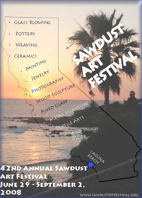
Sawdust Art Festival poster
Justification
For the Sawdust Art Festival, I used several different skills and techniques to create a poster that would catch the interest of the random passerby or the art enthusiast. I included a cutout of the state of California. Because the festival is held in Laguna Beach, a seemingly quintessential California city, it seemed appropriate to represent the entire state, as the festival will showcase local Californians. Within the state, I included many of the main types of art that the festival attendees will be able to see. This makes it clear that the festival is not only displaying a few types of art, but there is an extremely wide range of artistic expression, so there will be something for the entire family. The backdrop of the poster is a beautiful Laguna Beach sunset on the Pacific. It reminds the viewer that the festival is taking place in the breathtaking city of Laguna Beach, so they can see artworks by talented artists while enjoying the wonderful setting. The poster also includes important information such as the name, dates and website of the festival. The poster catches the eye and gives the viewer the most pertinent information.
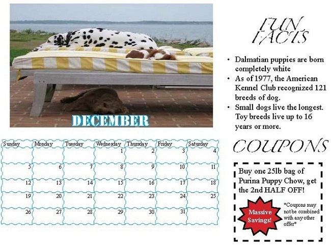
Humane Society Calendar
Justification
For the Humane Society Calendar, I chose only to include photos of dogs for two reasons. First, as we were only creating a sample of the calendar (four months instead of twelve), it seemed appropriate to focus on one animal that would be represented on the calendar in order to highlight the skills that went into the project as opposed to my ability to choose cute pictures of animals. Second, I'm quite partial to dogs, and I wanted to make my own dogs the star of this sample calendar. Even in black and white, this calendar is still something that any animal lover should have. Not only are all of the dogs represented very cute and cuddly, but they also represent a different side of these dogs' personalities. In addition, each calendar page includes three fun facts about dogs, all of which are very interesting. Each month also comes with a coupon for great deals at nearby stores that sell anything one's pet could ever yearn for. Pet lovers should purchase this calendar to help support the Humane Society and to bring a smile to their faces each day.
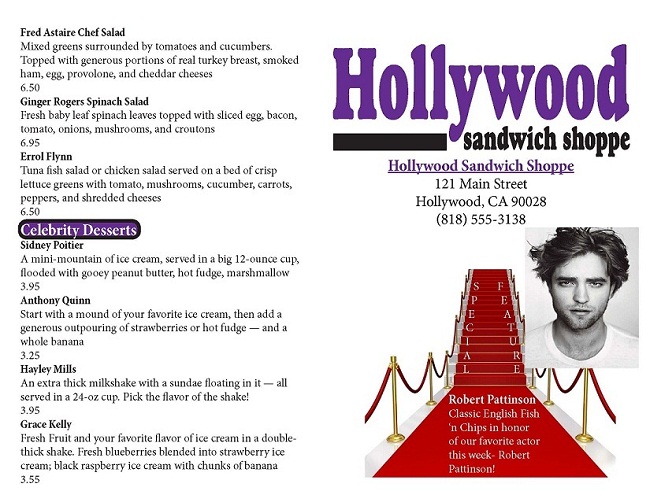
Restaurant Menu
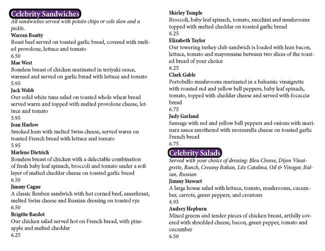
Justification
For the Hollywood Sandwich Shoppe menu, I used a bifold layout. The front page includes the name, address and phone number of the restaurant, and the logo that the restaurant had already created. It also has the special feature of the week, for which I used Robert Pattinson and a Fish 'n Chips entree as the placeholder. The two inner pages and the back page include all of the constant menu items, including Celebrity Sandwiches, Celebrity Salads and Celebrity Desserts. The descriptions and prices are included with each of their corresponding menu items. Each section (Sandwiches, Salads and Desserts) is emphasized using a larger, white font for the header within a purple background. The purple matches the color in the restaurant's logo. Not only does this keep the entire menu cohesive, but purple also seems like an appropriate color to use; purple is the color of royalty, and celebrities are often viewed as royalty in Hollywood.
Letterhead
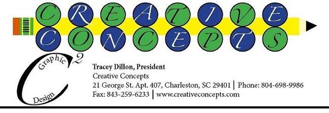
Justification
For the Dillon's new graphic design company, I created a logo that I believed would clearly show an emphasis in graphic design. The logo comes in two parts. The first part (the larger part of the logo) includes the name of the company- Creative Concepts. Using several different skills in Adobe InDesign, I created a unique way to display the company name. There is a pencil dissecting the words "Creative" and "Concepts." Due to the fact that the two words have the same number of letters, this part of the logo is quite symmetric. In addition, the pencil is representative of the company's purpose- to create graphic designs. This part of the logo is quite colorful, uses a fancy font, and included many different technical skills to create the layout of the text and the created pencil. The second part of the logo is much smaller and more concise. For this reason, it is more appropriate for singular use on an envelope. It is a "C" to the second power. The company name is Creative Concepts, after all. The text "graphic design" is curved within the letter "C." I hoped that this would show certain technical skills that prove that Creative Concepts is a worthy graphic design company. It also leaves no doubt in the consumer's mind as to what the company does. The small logo is also included with the larger logo on the business card and the letterhead. Due to confined space, only the small part of the logo is included on the envelope.